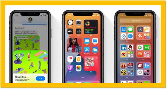
iPhone has begun pushing the official iOS14 update since September 17,2020. There are many changes in this update, not least two important new features: desktop Widgets and App Repository.

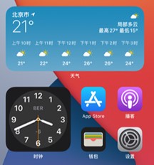
Desktop Widgets

This is a “widget” feature that Has long been available on Android, and iPhone is finally catching up after all these years. The desktop widgets in iOS14 are actually more like tiles for Microsoft Windows and Windows Phone.
App repository

This feature is also an existing “app library” or “App drawer” on Android. We can now put apps on the home screen, or we can stuff them into App repository that like trash can, this repository is also the best place for low-frequency apps. iPhone sorted and grouped apps according to their categories for us to find.
Of course, there are other improvements to iOS14, and we’re going to focus on desktop cleaning today.
Every desktop becomes “Themed”
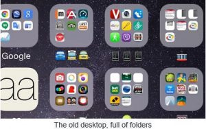
The old iPhone desktop, or “home screen” or “second screen”…It’s more like a pile of app icons. Once you remove an app icon from the desktop, you remove the app. To keep the app, you can’t remove the icon. So many users like to create folders that cluster together a lot of related low-frequency applications to prevent them from taking up too much desktop space.

Now iOS14 has the App repository, we can remove app relieved from the desktop, anyway we can have this app from trash can again. In this way, our desktop can be used to delete icons according to the purpose. And what people like most is that an iPhone desktop can be built according to a certain purpose or themed.
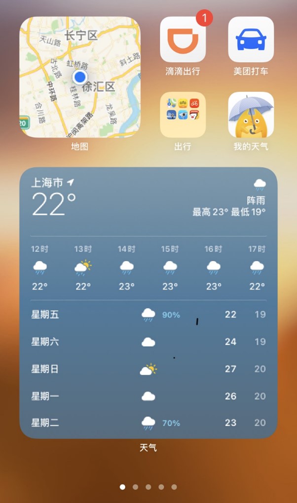
For example, our second screen which is related to travel, we used to create a folder and throw in a bunch of related maps, taxi apps etc. before. Now that we have the iOS14 widget, we can lay out some of the app icons around a widget. The widget itself like a tile that immediately reflects some information (no need to click to open it). We end up with a themed desktop that we can swipe to instantly know where we are, what the weather is like, and if there’s a new app in the future, maybe an intuitive view of traffic. When we need to take a taxi, the relevant App is next to the map component, which can be clicked and used immediately.

This is a trip themed of the desktop, according to your own efficiency needs, to create more style.
Finally, iOS14’s “desktop widget” is currently dominated by iOS’s official built-in apps. I recommend you to upgrade iOS14 and build your own efficient desktop.
